YOUR PASS Console
Our web application for creating and managing templates, cards and projects. It includes a built-in intuitive non-code designer which enables you to create and modify the contents and look of the cards in the Wallets of your customers using the Push function.
The app is browser-based (Safari and Chrome browsers are supported) and thus can be used anywhere and at any time,
as long as you are connected to the Internet.
YOUR PASS provides sandbox and production environments. Sandbox Console is a testing environment for all AXA entities. Production Console is divided to EU and US regions, please use them accordingly.

Creating an account
#1
Visit the respective Production Console
(EU or US) and click to ‘Create an account’.
Fill in your:
-
Email address for logging in
-
Choose Shown/displayed name
-
Create your own password
-
Repeat password
-
Accept to the terms of service
And click to ‘Sign up’.


Card design and creation
Branding, banners, colours
There are 5 template layout options basically depending on the volume of used texts. YOUR PASS will guide you through details and will recommend the best suitable pkpass format for your specific use case. The difference is purely visual, the functionality is the same for all of them. To keep it simple, let’s focus to the three most used templates for Insurance clients: ticket, store and generic layout.


TICKET
Perfect for insurance policy passes and other formats with more text fields. Sharp edges, cutout in the top middle, narrow banner image (640x168px, PNG), max file size is 100 kB.


STORE
Spotlight on image, fewer text fields. Rounded corners, horizontal banner image (640x246px, PNG), max file size is 100 kB.


GENERIC
Ideal for business cards and similar formats. More text fields, rounded corners, one square banner positioned on the right. Banner size is 180x180px, PNG, max file size is 60 kB.
Each pass has a front and a back of the card. The basic anatomy of a pass is fixed and can only be changed to a certain degree. That is why it’s great to be aware of the format’s possibilities before creating a template.
The front side represents your brand and product in colours, images and brief, most frequently used information. You can use plain text and emojis in the text fields.
The back is much more content focused. You cannot change the background colour or include images, but you can add an unlimited number of text fields. The text fields do not have a character limit either and you can also use plain text, emoji and hyperlinks, so you can use the back to include more detailed information, contact details, links to documents, websites, map navigation etc.
Icon
The icon is displayed when a pass is shown on the lock screen and by apps such as Mail when the pass is attached to an email. The icon should have dimensions of 58x58px, and must not have transparent elements.

ICON
Logo
The logo image is displayed in the top left corner of the pass beside the logo text. The allotted space is 0-320x100px, meaning the width can be up to 320px. The logo image can thus be for example 100x100px or 320x100px etc., the width is adjustable. Logo should be provided as a transparent PNG file with sufficient colour contrast according to your chosen background colour.
PLACEHOLDER
FOR LOGO

Layout colours
There are three colour options helping to brand the card.
• Background
• Label (titles)
• Foreground (content)
All colours are configurable in HEX colour code or RGB format. The colours on the back of the pass cannot be changed.
LABEL
FOREGROUND

BACKGROUND
Fonts
All font types and sizes are determined by the device default settings and cannot be changed.
Apple Wallet uses the default iOS font-SF Pro.
YourWallet app uses IBM Plex Sans Condensed.
Using Emoji
Emoji glyphs help to format and structure your card content.
To make sure how are the used glyphs displayed, visit emojipedia.org.
📞 🌍 ✈️ ✅


The back is much more content focused. You cannot change the background colour or include images, but you can add an unlimited number of text fields.
The text fields do not have a character limit and you can also use plain text, emoji and hyperlinks, so you can use the back to include more detailed product information, policy details, contact details, links to documents, websites, map navigation, chatbot, online claims, etc.
For linking URLs, please use supported HTML tag <a href>.
Back of the card
Using a chatbot
You can link a chatbot on the backside of the card using a URL. The customer will then be able to open the chat window and start conversation with you directly from the card.
You can also choose to include some information from the pass to help you identify the user when they use the chatbot.
E.g. if you were producing insurance assistance cards with unique policy numbers, you could include that in the URL so that your customer care agent can already have all the details ready and answer the customer prepared.

Multiple languages support


Digital cards are multilingual so you can add as many languages as you like - we currently support 187 languages.
Each created card contains all existing language versions and the app determines which language to display based on the system settings of the user’s phone.
If the phone’s language isn’t available, the English version will be displayed. If the template hasn’t been translated into English, the card language will be determined by alphabetical order.
Recommendation: For proper AXA's reporting purposes we highly recommend to set up separate project/template for each language.
Push notifications


One of the greatest features of digital cards are notifications. You can communicate any message, even personalized, and it will be delivered onto a device lock screen.
Communications examples:
-
insurance has just started / is about to expire
-
emergency warning in your travel destination
(e.g. Covid-19 related) -
new promotional offer related to purchased product
-
discount for the next trip
-
service / claim related
-
operational info
-
partners offers
-
loyalty points balance changed
How to trigger push notifications
Please note that every notification has to be tied to a specific text field on the template. It is possible to push every text field (composed of Label and Value). First select which field you will use, then include %@ in the ‘Change message’ and then make a change in the ‘Value’ field and a lock screen notification will be sent out. As long as %@ is in the ‘Change message’, users will receive a notification every time ‘Value’ field is updated.
Good to know:
If the content is more than two lines on older phone displays, the user will need to expand the notification to view the full content and not all users are aware of this possibility. When the character count exceeds 200 characters (‘Value’ field + ‘Change message’ field combined, including spaces), the text will get cut off at the end for iOS users. We recommend making the notification brief and to the point.
It is possible to enable only one notification message per template at once. If you set up more than 1 field and the value changes within 1 update, you will get a generic message “Your event ticket changed” instead of receiving full notification. YOUR PASS will assist you with the correct setup if you need a more complex scenario.
💡 USEFUL TIPS FOR CREATORS:
1. To deliver best possible user experience, YOUR PASS recommends to notify fields on the front side of cards.
2. Using emojis may enrich the content and make it more attractive, or even replace some words.


What happens after receiving a push notification
Once you tap a notification on the device screen, Wallet (on iPhone) or YourWallet (Android) app opens and shows the respective digital card with highlighted (notified) field. The field is marked with a yellow circle and is default by operating system, thus it is not configurable.
Download journey


Cards can be distributed through multiple channels by a download link or a QR code.

Client is redirected to a download page, clicks the button and adds the card to mobile wallet.

The card is ready for action!
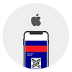
Downloading on iOS
User perspective

Click a link or scan a QR code with your mobile camera.

Digital card opens in a browser, tap “Add” at the upper right corner.

Card is added to Apple Wallet, a native app to every iPhone. Flip the card by clicking the circle at the upper right corner.
Tech background

#1
Pass (=pkpass file)
created in YP environment

#2
Pass is distributed by AXA
#3
Pass preview in default browser on iOS device
(1 millisecond)

#4
Pass (pkpass file) is physically downloaded into device
Downloading on Android
User perspective

Click a link or scan a QR code with your mobile camera.

Digital card opens in a browser, tap the button “Add to YourWallet”

If you haven’t used YourWallet previously, download it free from Google Play Store.

Card is saved in YourWallet. Flip the card by clicking the circle at the lower right corner.
Tech background
#1
Pass (=pkpass file)
created in YP environment
#2
Pass is distributed by AXA
#3
Pass preview in default browser on Android device
#4
Pass (pkpass file) is physically downloaded into device
Preview page
Preview page is a part of the YOUR PASS platform for card downloading. It is a smart web page which recognises from which device the customer came from and according to this channel will adapt the page. Preview page is available in English, German, French, Spanish, Portuguese, Czech, Slovak, Polish, Hungarian and Russian language.
DESKTOP
Desktop version includes download buttons for both OS - Android and iOS.

MOBILE
iOS
Android

iOS automatically recognizes PKPASS format and displays “Add”
at the upper right corner.

Android version shows an “Add to YourWallet” button.
Supported barcode types
We support barcode types supported by the pkpass format. Currently these are: QR Code, PDF 417, Aztec and CODE 128. When digitizing your own cards other barcode types will be converted to CODE 128 which should have no effect on functionality.
A QR code is a machine-readable matrix barcode containing encoded data, typically used for storing URLs, contact or calendar data, email address, geo location or other information that is designed to be optically scanned by the camera on a smartphone.


QR code
Aztec

Code 128

PDF 417